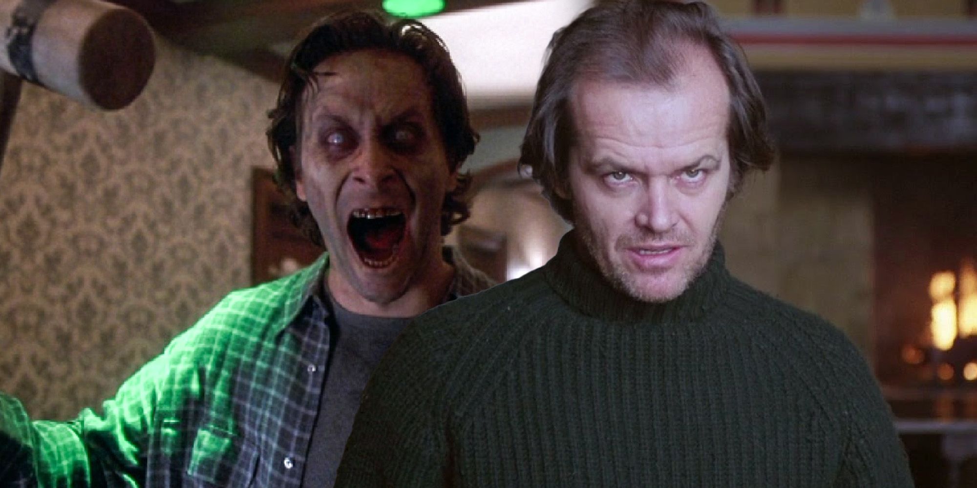
It’s sacrilege among film fans to suggest that anything about Mick Garris’ critically-maligned The Shining miniseries managed to outshine 1980's Kubrick movie adaptation The Shining, but one often overlooked detail of the small screen version is more effective than its more revered cinematic counterpart. Released in 1997, Mick Garris’ The Shining miniseries was largely seen by horror fans and critics alike as Stephen King’s attempt to regain control of his most famous story from its revered Kubrick adaptation with very mixed results.
A Clockwork Orange director Stanley Kubrick adapted The Shining to film in 1980, and transformed the text in the process, much like he did with Anthony Burgess' less cynical source novel when adapting the bleak, dystopian sci-fi story. The infamously cold director took The Shining's moving, scary story of a dysfunctional family with a volatile alcoholic at its center and turned it into a dark comic mystery filled with cryptic clues and surreal non-sequiturs. King famously hated the film and its critical success, although he’s softened up in recent years.
King saw the '90s miniseries as an opportunity to adapt The Shining the way he envisioned it, and to its credit, the small screen version does hew far closer to his novel. Unfortunately, that’s not necessarily a good thing, as The Shining's languid pacing translates to being slow and even boring in the miniseries. The miniseries also didn't have a big enough budget to realize some of the more ambitious scenes lifted from the novel, with the hilarious CGI topiaries being a particularly notable misstep. Still, there is one area where The Shining miniseries outclasses Kubrick's movie. In this area, there’s an interesting reason behind the different approaches taken by the miniseries and the more critically acclaimed Kubrick movie.

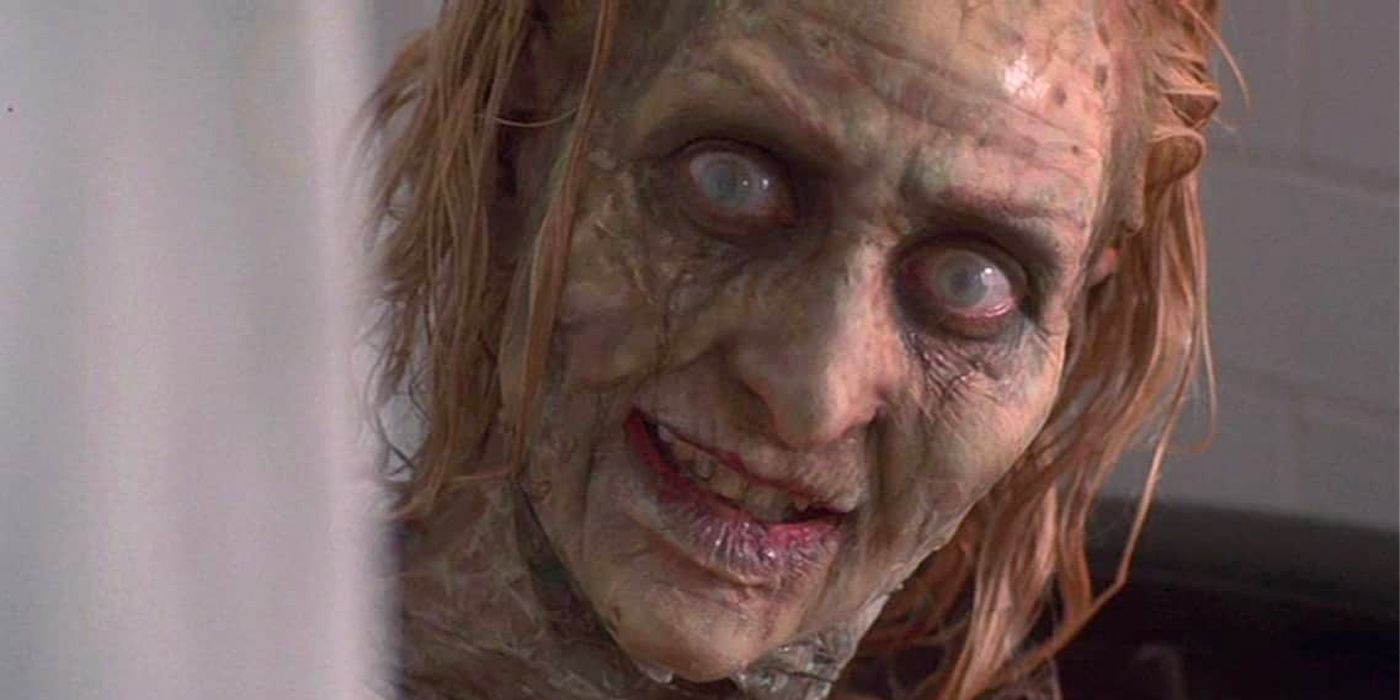
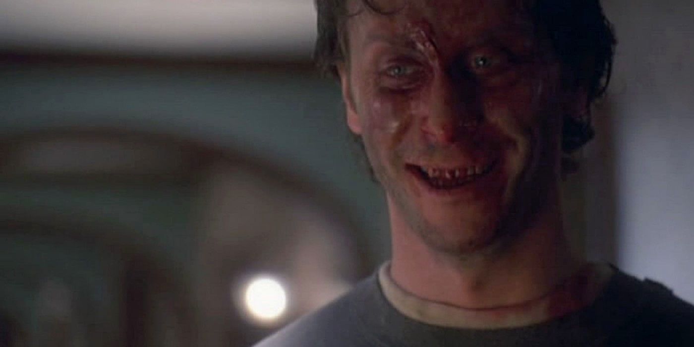
The makeup effects used for the Overlook's ghosts - particularly the lady in Room 217 - throughout The Shining miniseries are far more effective than those utilized in Kubrick's film. The scene where Danny sees the decaying, grinning body in the bathtub is more viscerally scary than the foreboding, but less scary and more strange equivalent scene in Kubrick’s film, and it's thanks to more convincing makeup effects in Garris’ miniseries. There’s a reason Kubrick opted for a different sort of ghost, but there’s no getting around just how effective the ghosts in Garris’ adaptation are.
The design used in Garris' miniseries, with empty white eyes reminiscent of the Evil Dead series’ Deadites and uneven green-white pallor, has gone on to influence the design of countless ghosts and demons in movies and TV shows since its release. This influence can be specifically be seen in the ghosts that appear throughout director Mike Flanagan's Netflix hit The Haunting of Hill House, particularly episode 6’s bed-bound elderly woman. It can also be seen in Hill House episode 10’s Poppy Hill, the insane flapper whose empty eyes and unsettling grin make her a dead ringer for Lorraine Massey, the miniseries’ inhabitant of Room 217.

The exemplary makeup effects featured in The Shining miniseries were achieved by a team of legendary makeup artists including Ve Neill, Joel Harlow, and Bill Corso, who won a well-deserved Emmy for Outstanding Makeup. But even for accomplished industry veterans, the task of making a terrifying, but still TV-friendly nude ghost was no small undertaking for the team involved. Unlike many popular contemporary horror series, the team didn't have the creative freedom of cable’s lack of content restrictions, and ended up using layer after layer of Saran Wrap and KY Jelly, alternating between each to create a gruesome texture and applying milky and purple tones throughout to create a mottled appearance. The actor's wrapped body was then coated in liquid latex with certain areas torn off to give the uniquely unsettling sense of peeling skin. The result is an unforgettably creepy bit of makeup which more than earned its accolades and enduring influence in horror media.

It’s a pretty bold claim to say that the elderly, cackling inhabitant of Kubrick's Room 237 isn’t scary, even if she is less unsettling than the miniseries’ equivalent. But Kubrick’s adaptation was made at a time when practical prosthetics and makeup effects were at the peak of their popularity. In 1980, fellow critically acclaimed horror movies, The Howling and An American Werewolf in London, won massive plaudits for showcasing the incredible, latex-based practical effects work of Rob Bottin and Rick Baker. Bottin would soon go on to create some of cinema’s most impressive makeup effects in 1982’s The Thing. Meanwhile, Tom Savini was already making a name as an impressive figure in makeup effects via influential slasher films like Maniac and Friday the 13th. So why did Kubrick opt to play down the importance of makeup effects in his movie during a time when they were peaking in popularity?
Kubrick’s The Shining may not focus on makeup effects as much as the miniseries, but this approach is mirrored in the film’s acceleration of Jack’s mental instability and its dark comedy tone. It’s an approach that crops up throughout Kubrick’s films, wherein the director actively discourages the audience from identifying with the protagonist. For example, one of Kubrick's best movies, the Vietnam war film Full Metal Jacket, stood out from competitors like Platoon and Apocalypse Now by making the horror of war less dramatic, tragic, and balletic, and more sudden, bleak, and pathetic. Much like viewers are discouraged from feeling for Full Metal Jacket’s doomed platoon, Kubrick’s version of The Shining leads viewers away from sympathizing with Jack Torrance by having the character lose his mind faster, display less likable characteristics, and fail to redeem himself in the 1980 movie.
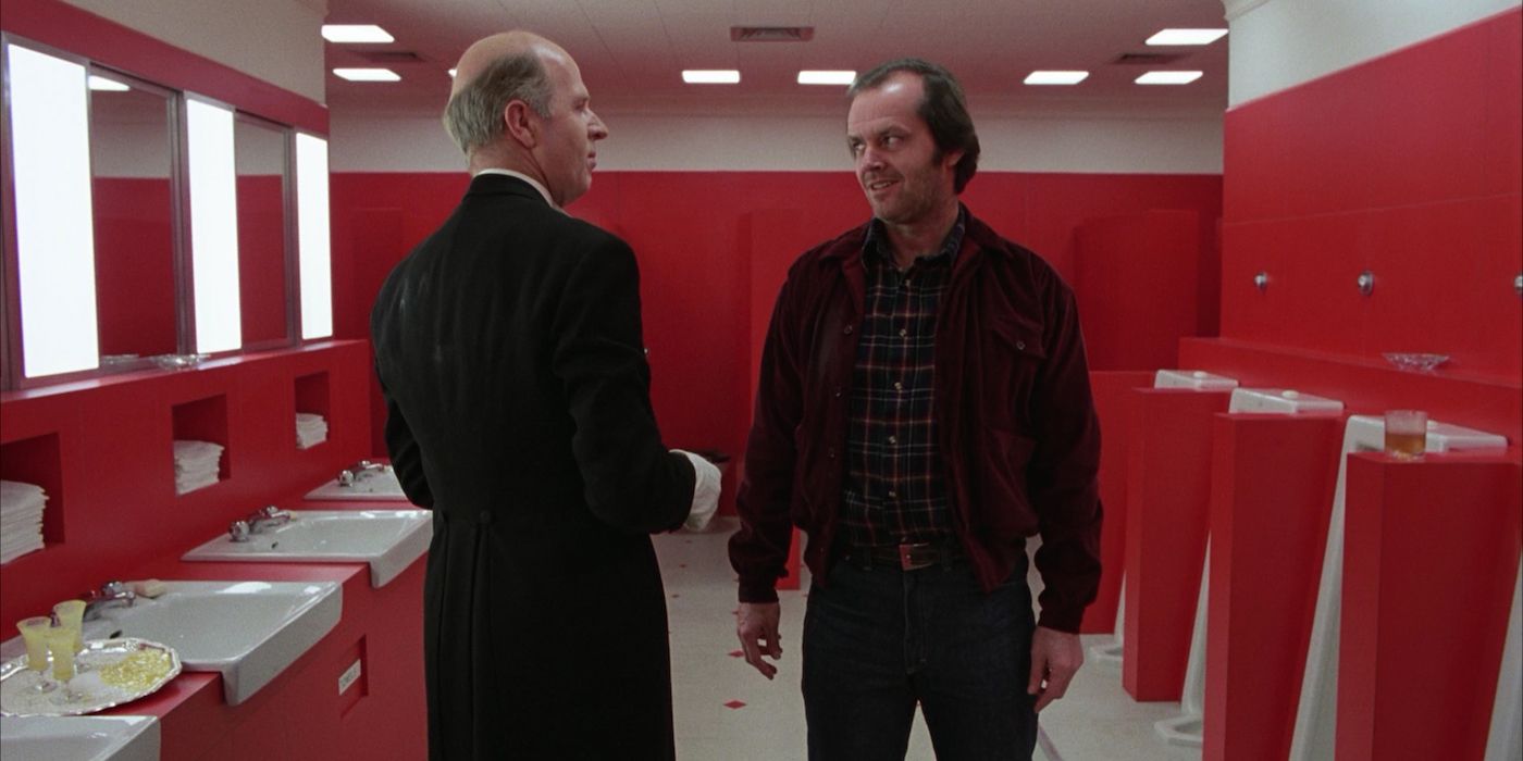
The ghosts of the miniseries are terrifying when encountered by Jack and Danny because King (and Garris) wants the viewer to empathize with both the deeply flawed father and his son. Kubrick, however, wants viewers to keep a healthy distance from Jack, resulting in the odd tone of scenes in his version of The Shining where Jack encounters the Overlook’s ghosts. When Danny - the character Kubrick wants viewers to connect with - encounters the Grady twins, the sequence takes place close-up, centers Danny’s reactions, and is terrifying. In comparison, when Jack encounters their father, the scene is filmed in an oddly comic long shot and, although it’s deeply creepy, Jack Nicholson’s off-kilter performance and the jagged spikes of morbid humor make it clear that Torrance is as dangerous as the hotel’s ghostly inhabitants and not a relatable figure the audience is intended to identify with. He has, after all, always been the caretaker.
from ScreenRant - Feed https://ift.tt/3k6MjMU

No comments: