Last month, Discord celebrated its birthday by updating its logo. The popular communication app has had a lot to celebrate recently. With the pandemic essentially forcing everyone to stay at home, Discord thrived and expanded its reach to over 150 million users and across different niches worldwide. Since then, the company explored new markets and even flirted with a potential sale to a larger company.
Discord was founded in 2015 and arrived with the fairly simple premise of allowing gamers to work together on co-op missions or plan matches against each other. It thrived under this banner, offering a a way for gamers to form communities with others. Then, 2020 happened and the world started needing more ways to remain in touch with friends and family. This helped Discord to become a haven for even more people, rather than just a gamer's paradise. The growth even attracted the attention of other companies. Microsoft, for example, was reportedly in talks to buy the company out before the negotiations ultimately failed. Now, as Discord celebrates its sixth birthday, the company has celebrated its success with a slight redesign.
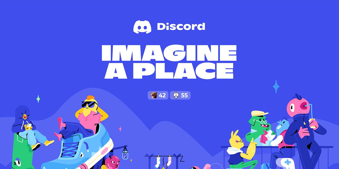
Now seen on the app (and explained in an official blog post), Discord has updated its logo. Officially known as Clyde, the logo now has rounder top and bottom shoulders. The new design also replaces the sharp antennas of the old logo with more shoulder-like ones. In addition, the logo's colors are also now more saturated, creating a darker shade of Blurple, as Discord calls it. Finally, Discord also updated the logo's wordmark by using a new font and changing it to title case.

Besides celebrating its birthday, Discord has practical reasons for updating its logo. For one, the company noticed that the logo's old antennas didn't show particularly well when the logo was printed on certain materials, especially on smaller formats. From a designer's perspective, Discord has also freed the logo from its former constraints inside a speech bubble. Though the speech bubble showed what Discord is about, the app's popularity (and its various uses these days) likely makes the design element redundant now. The old design also limited how the company could customize the look of the logo. Finally, the old logo was surprisingly asymmetrical. This might not be so obvious, other than to the most eagle-eyed of purveyors, but solving the issue was something on the company's to-do list.
More intangibly, Discord's new logo aims to present the company's friendliness and playfulness, while maintaining familiarity for its older users. It likely reflects the company's relatively new initiatives to cater to a more general audience and move past its gaming-centric identity. Overall, Discord's new logo represents a new era for the communication platform.
Source: Discord
from ScreenRant - Feed https://ift.tt/2SMqtpU

No comments: